The idea
I found myself recently with a large time series that I was trying to summarize. The time series had many data points for every day and I found myself wondering how the daily distribution varied.
The code
The implementation uses three ideas:
- Grouping data in some way, for example generating a list of data points per day, I can plot a scatter of that data for each group.
- If I jitter that data, I can better see the distribution
- Interpolating the density of the data using a histogram (which is faster than using a Kernel Density Estimate approach), we can have pretty colors to make it even more readable.
Limitations
- The code is untested using time as the x-axis, but would probably only need a reimplementation of \( \verb|jitter_x_axis| \) to use datetime timedeltas.
- You need to bring your own data set which is already grouped, but that shape isn’t common to build in polars or pandas, so it might need a bit of finnicking.
def density_lineplot(data: npt.NDArray, out: str):
    """Plot density over time for grouped data."""

    fig, ax = plt.subplots(figsize=(20,10))

    for row_idx in range(data.shape[0]):

        x = row_idx*np.ones(data.shape[1])
        jittered_x = jitter_x_axis(x)
        y_set = data[row_idx]
        z = make_density_color(x, y_set, 20)

        ax.scatter(
            x=jittered_x,
            y=y_set,
            alpha=0.1,
            c=z,
            cmap="magma",
        )

    plt.savefig(f"{out}.png")
    plt.close()
Some pictures
Enjoy some simple example outputs. They were drawn using the following base:
import numpy as np

time_indices = 100
data_points_per_time = 500

xs = (np.ones((time_indices, data_points_per_time))
   * np.reshape(np.linspace(1, time_indices, time_indices), (-1, 1)))
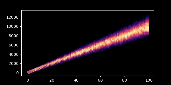
A negative binomial:
data = np.random.negative_binomial(100,1/xs)
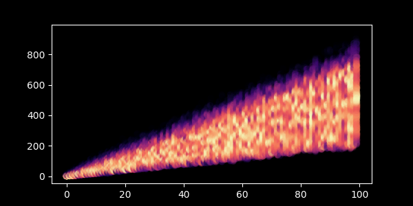
A gamma:
data = np.random.gamma(xs, np.random.uniform(2,8,xs.shape))
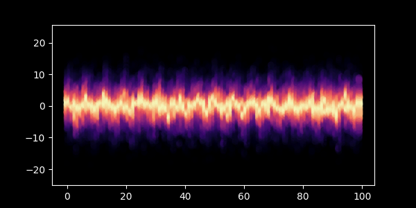
A normal with an extra sine wave thrown in:
data = np.random.normal(np.sin(xs), np.random.uniform(2,8,xs.shape))
Leave a Reply